

300+
Global styles & variables
5000+
Components and variants
What is Nuance UI?
In today's fast-paced design landscape, a design system is no longer a luxury—it’s a necessity. Nuance UI is a state-of-the-art Figma UI Kit and Design System designed to streamline your design process and elevate your user experiences. It offers a flexible, scalable, and consistent way to create user interfaces. Whether you're designing for Android, iPhone, tablets, laptops, or desktops, Nuance UI delivers a seamless experience.
⚡ Built with Figma’s Latest Features
✓ Auto Layout: Components automatically adjust to different screen sizes and layouts.
✓ Components: Reusable, modular elements for efficiency and consistency.
✓ Variants & Variant Properties: Manage multiple states (hover, active, focused, disabled) within a single component.
🌍 Cross-Device Compatibility
✓ Optimized for Android, iPhone, tablets, laptops, and desktops.
✓ Ensures a consistent user experience across all platforms.
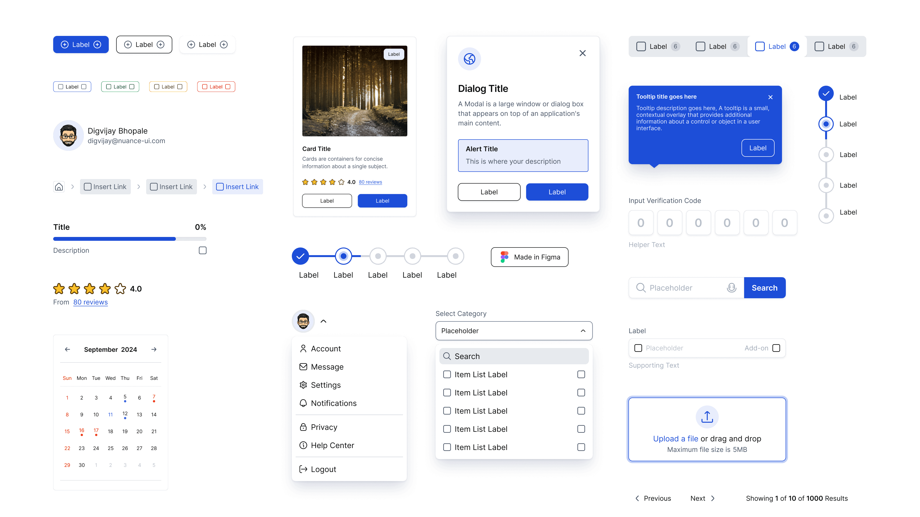
🎨 300+ Styles and Variables
✓ Predefined styles and variables for typography, colours, spacing, shadows, grids etc.
✓ With one click, you can modify any style globally, making it simple to update a design system across multiple projects.
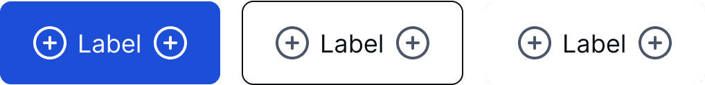
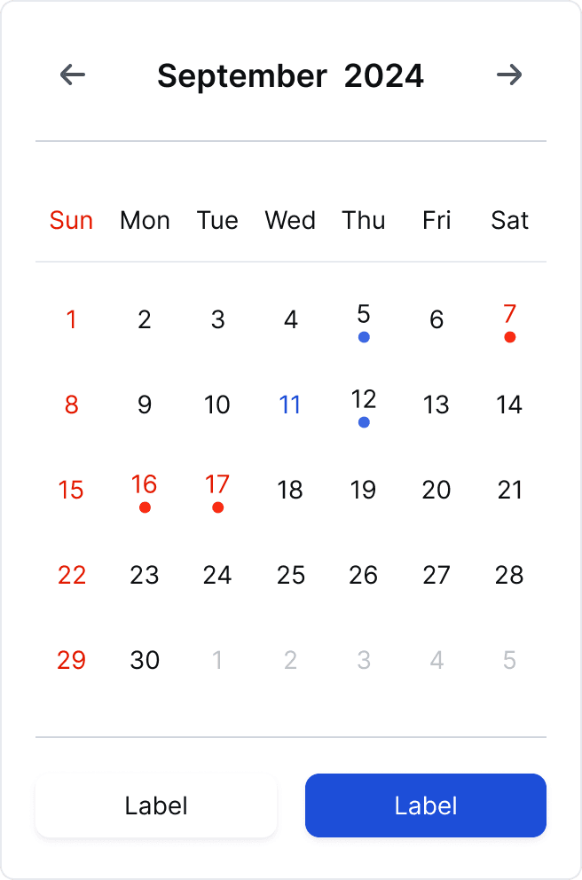
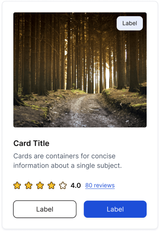
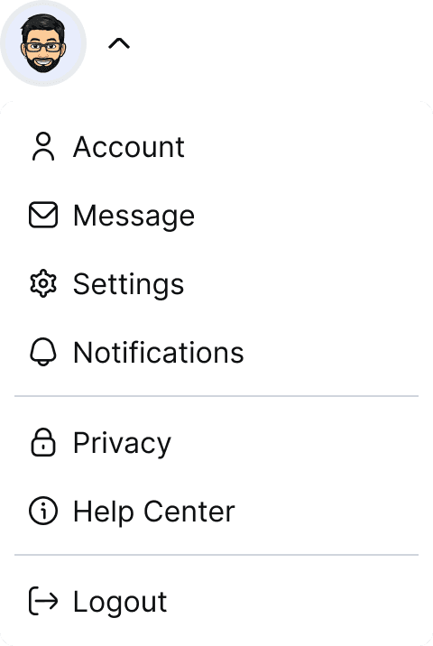
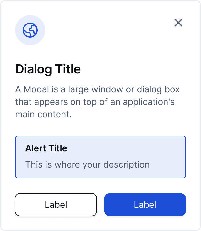
🚀 5,000+ Components and Variants
✓ From basic UI elements (buttons, inputs) to complex components (modals, cards, dropdowns, calendars etc ).
✓ Designed for scalability and flexibility across various use cases.
♿ Accessibility-First Design
✓ Color Contrast: Meets accessibility standards for legibility.
✓ Focus States: Clear visual indicators for keyboard navigation.
✓ Accessible Labels: Properly labeled components for screen readers.
✓ Responsive Touch Targets: Optimized for users with motor impairments.

“ With our new visual branding and language in place, the new Shopify brand clearly captures the essence of our current and target customer base, our employees, and our values. ”
Tobias Lütke
CEO, Co-founder | Shopify


Conclusion
The StreamLine mobile banking app redesign successfully addressed the usability issues, resulting in a more intuitive and user-friendly experience. The improved UX/UI design led to increased user adoption, engagement, and satisfaction, demonstrating the value of a well-designed template for UX designers.