
Boosting User Retention Rates by 44% for a Leading Global Insurance Company: My Experience
In this project, I was the Solo Designer who owned this project and worked on it from start to finish. I did collaborate with a lot of other people on this project.
January 2023 to October 2023
45,000+
UX Designer (Me), Developer, and Project Manager
Requirement Gathering, User Research, Stakeholder Interviews, Visual Design, Prototype, and User testing.
Challenge
As the company grew, the number of projects with Clients grew as well. Each project has a timeline to follow, and products and services to create, manage and deliver. Now, the company does have an internal portal to manage this. But it was completely outdated and not great in terms of functionality and accessibility. I mean, you know how internal tools are right?
Hence, we decided to revamp the entire portal from the ground up. And make the process more engaging and user-friendly ✨.
Results
The resulting dashboard delivered a simple yet powerful analytics platform tailored to the needs of various teams.
We have successfully reduced 400–450 Man-hours to 60 Man-hours per year significantly improving the system's efficiency.
Data showed executives loved tracking global goals, and sales leaders enjoyed seeing the regional performance. This led to a 54% increase in new User Adoption rates!
The ability to slice and dice data on the fly has enhanced user engagement, leading to a 44% increase in User Retention rates.
85%
Reduction in man hours
54%
Increase in new user adoption
44%
Increase in user retention
Unfortunately, due to confidentiality, I can’t share my in-depth research and Figma files, but let’s dive into the design process!
So let’s get started 🚀
Design Process
Week 1: Understanding the System
I worked closely with the people from different departments using the current system, to understand the current flow and also what tools they were using to gather, sort and present the data.
To understand the current way of doing things, I started attending the meetings and took notes that took place bi-weekly.
I also talked with the meeting organizer and understood what things they did before the meeting as this meeting was with the client.
Week 2: User Research
Formulated Questions — Created questions to explore user journeys and their pain points in departments like HR, Sales, Finance, QA, Marketing, Recruitment etc.
User Interviews — I conducted 30–60-minute calls with around 35 users across different departments to understand user's needs and the problems they are facing.
Week 3: Gathering Insights
After two weeks of studying the existing system and talking to users, we gathered a lot of data that helped us understand the problems users were facing:
Key Findings:
The data was not displayed in an organized way, making it hard to understand.
There was no single place where users could view live metrics and data at any given time.
Data was scattered across different spreadsheets, and presentations for clients had to be manually created in PowerPoint.
Many tasks had to be done manually, which was very time-consuming.
These findings showed that users needed a better way to view data that was more organized and accessible. They also needed a solution that could bring all the data together in one place and automate some of the manual tasks to save time and reduce errors.
Week 4: Arranging the Date
Data Inventory — Made a list of all the content to be included in the system. We also excluded data that is irrelevant but present in the system.
Categorization — As there was lots of unorganized data, The first thing we did was break the system into categories which will help the user to navigate easily. This step also helped us to create a logical structure for our system.
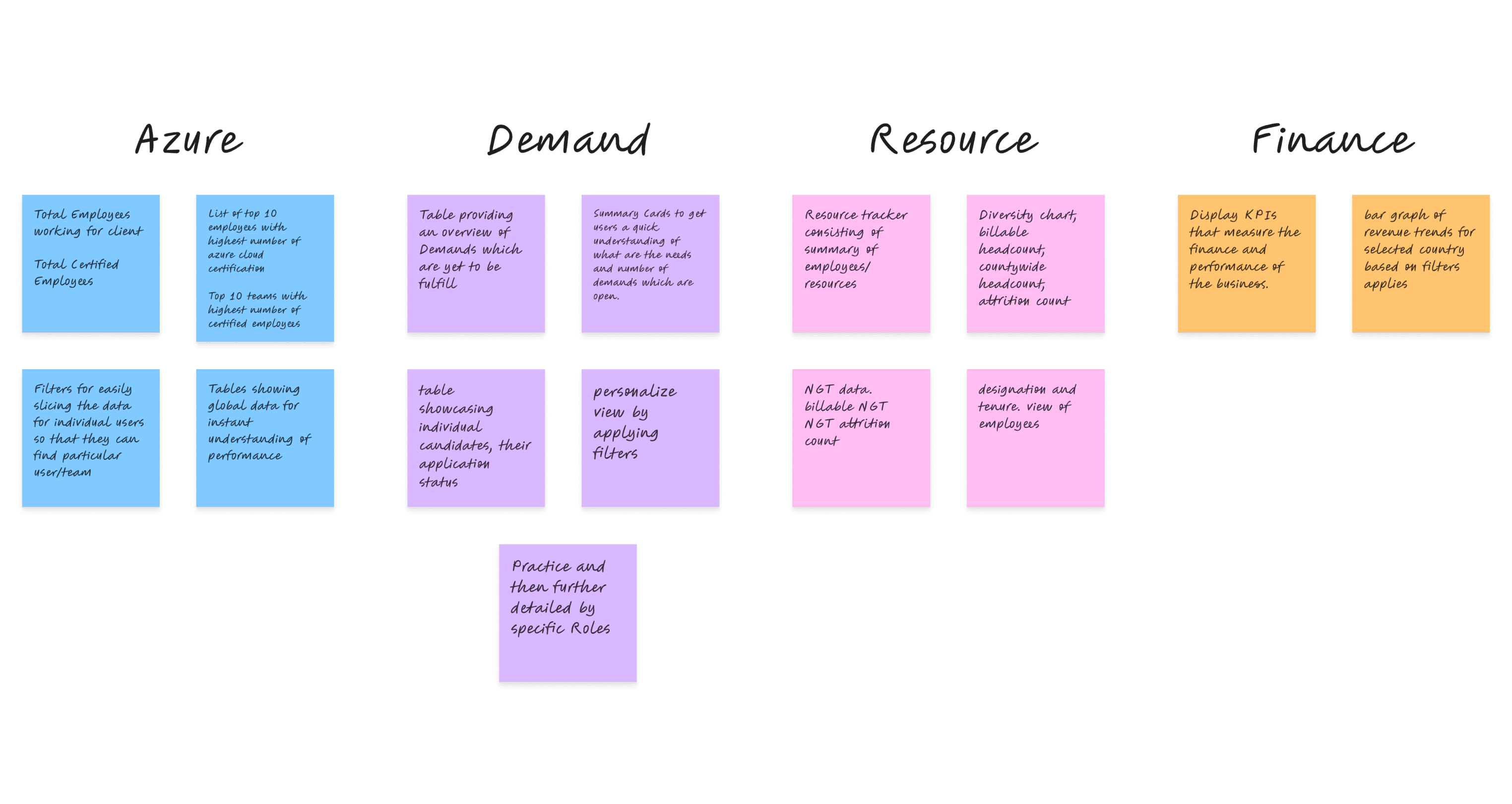
Page Structure — After the categorization of the system we defined a structure for various pages and sub-pages. Here is the resulting page structure.
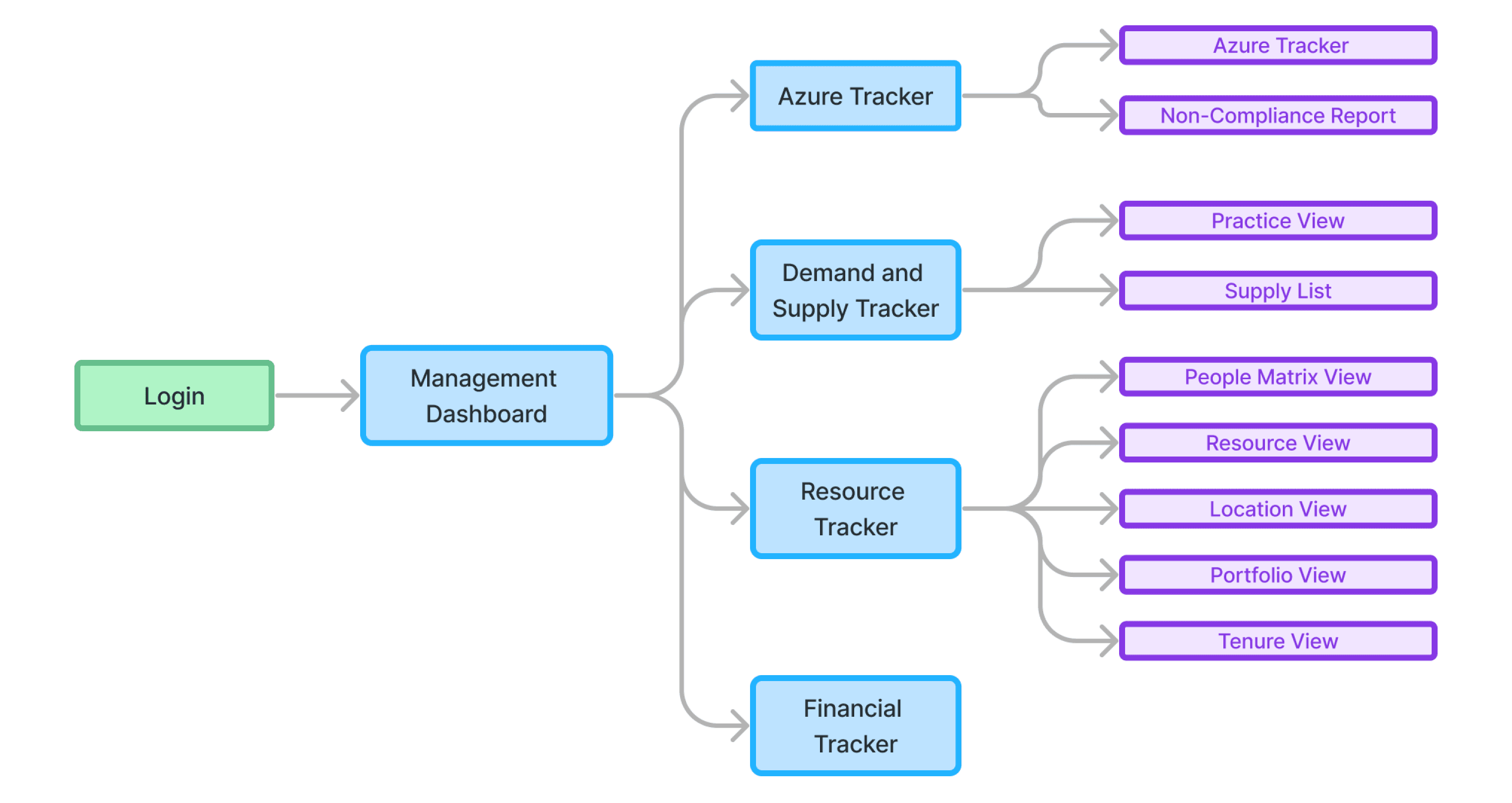
By organizing the information in this way we were able to ensure that users could easily access and interpret the relevant data, leading to more efficient decision making and improved business performance.
Week 5: UI Design
During our last interaction with the client we presented our findings to them, 🚨 they asked us for initial UI Designs of our new system to get an idea of our process.
So we had to push our timeline and start designing.
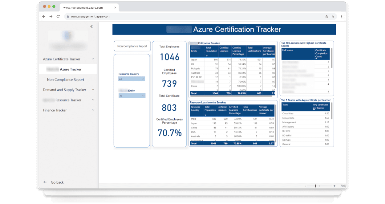
Here are some dashboard UI Designs.
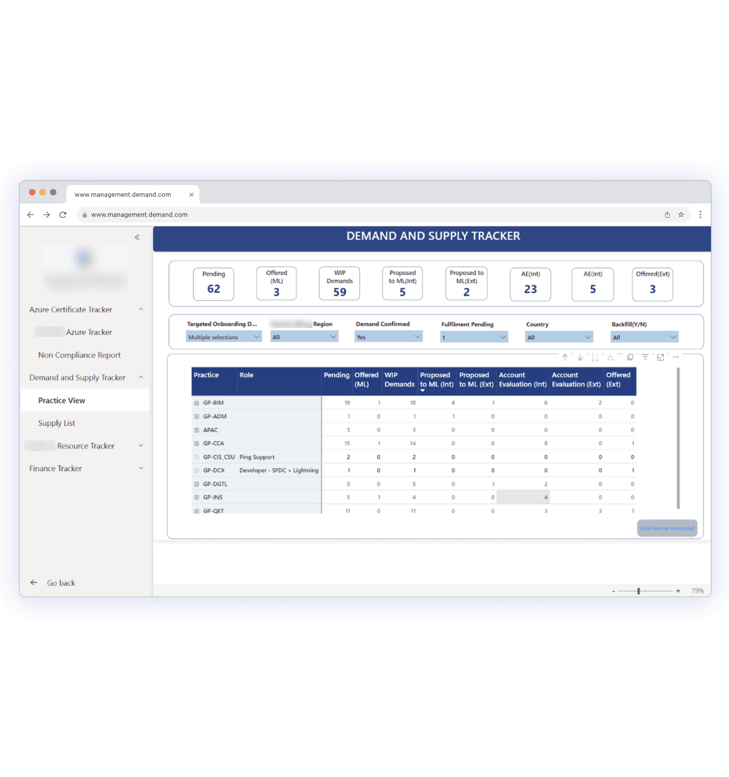
It offers a comprehensive and user-friendly analysis of talent needs and potential solutions across the group.
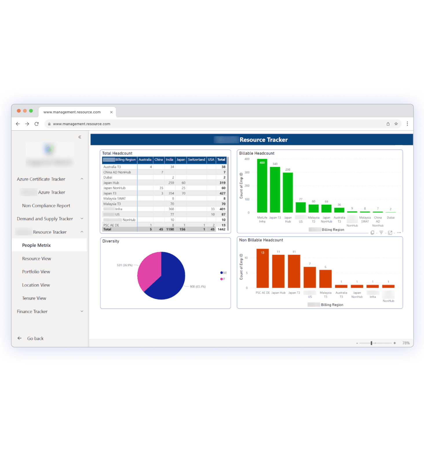
Think of the Resource tracker as your organization's mastermind for resources. It keeps track of everything from who’s available to what technologies and tools they are trained/worked on, ensuring optimal resource allocation and avoiding bottlenecks.
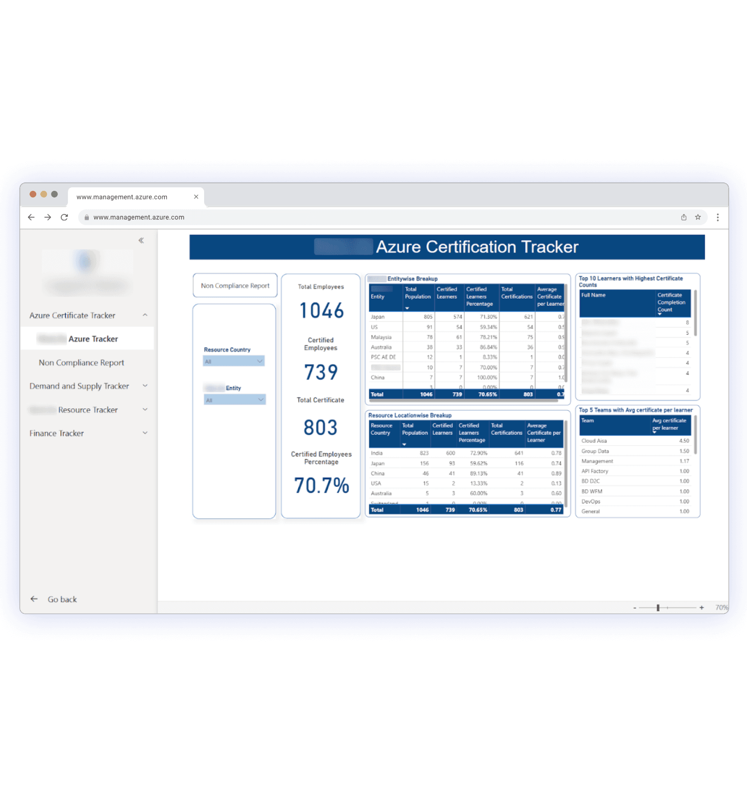
It provides an in-depth analysis of employees who have completed their Azure certifications.
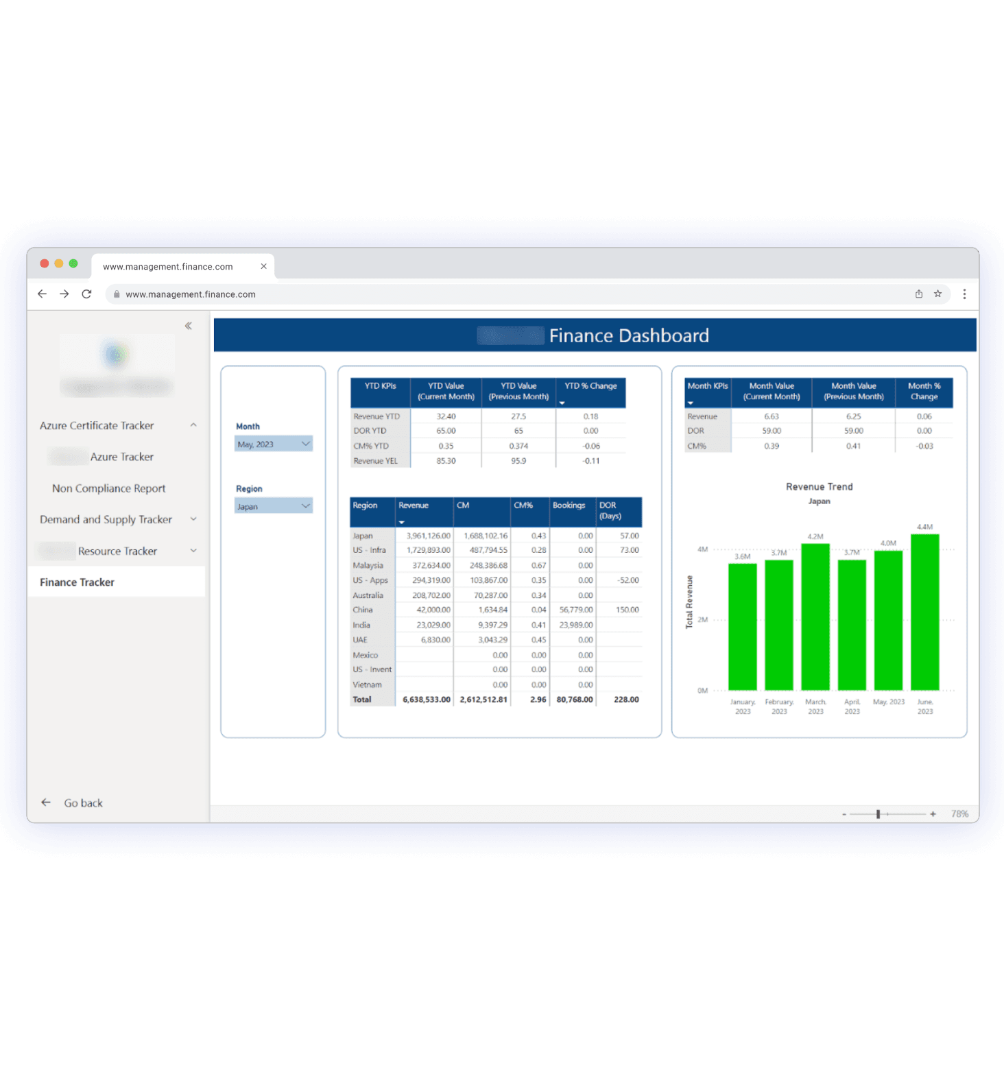
It serves as a centralized platform for visualizing and analyzing KPIs and other financial metrics, providing a comprehensive understanding of an organization’s financial health and performance.
Let's rewind and see how things went!
This project pushed me to the limit! Designing such a large dashboard with intricate user flows and unexpected scenarios was a first for me, but it was incredibly rewarding to see it come together.
Mapping out a huge system — The real challenge was what kind of data to feature on the dashboard. I needed to carefully consider what information would be most relevant and useful for users while also ensuring that the dashboard remained visually appealing and easy to navigate. It required a lot of planning.
Figuring out the cases — This step played a huge role before jumping into the UI design. It helped me to have a clear vision of what the user wants ensuring that we don't miss any cases.
Balancing business and user needs — Designing a new system pushed me to brainstorm ways where we could incorporate the business needs while not taking away a smooth experience.
Developer Handoff — For this project, I worked closely with the developer ensuring that my designs were developer-friendly so that the final output matched the UI designs.
And with that, we're done!
Read the whole thing? You’re amazing! 🫡 please feel free to reach out to me on professional platforms such as LinkedIn.